


Meet the business
A Thoughtful Plate
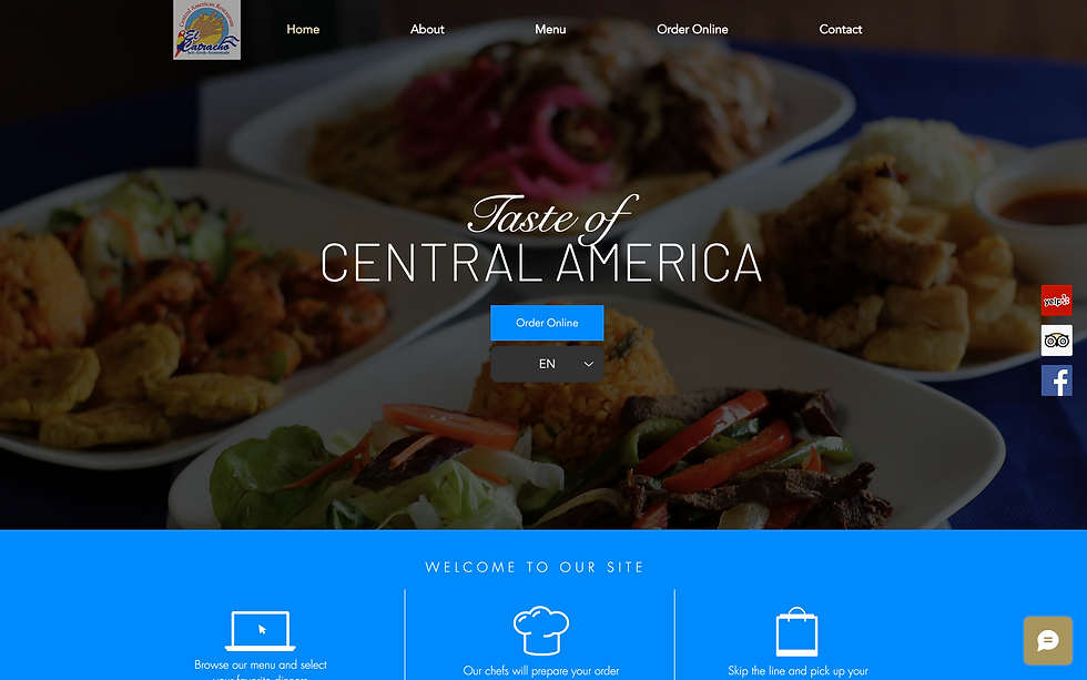
The primary goal was to design and develop a website that could act as a true digital home for A Thoughtful Plate. The experience needed to clearly showcase their menu, support mobile users, and create a pathway for wholesale inquiries as they expanded their operations. We focused on building a structured and flexible system that allows the brand to manage their offerings with ease while presenting them in a clean, intentional way. The site also needed to support their transition from pop-up driven visibility to a more consistent, accessible presence online. The final result provides clarity across the board—making it easier for customers to explore the menu, stay connected, and for potential partners to take the next step.

A FOUNDATION FOR GROWTH
Project
Goal
The primary goal was to design and develop a website that clearly communicates A Thoughtful Plate’s offerings while supporting their continued growth. The experience needed to highlight their menu, reinforce their brand story, and create a more seamless way for customers to interact with the business. We focused on building a clean, flexible structure that could evolve alongside their operations—whether through pop-ups, catering, or future expansion. The final site provides a more organized and intentional presence, helping the brand show up with clarity while strengthening its connection to the community.


Project Highlights
Project Highlights
CUSTOM CMS
We built a flexible content system to organize and showcase menu items in a clear, structured way. This allows A Thoughtful Plate to easily update offerings, highlight new dishes, and adapt as their menu evolves.
WHOLESALE INQUIRY FORM
A dedicated form was created to support wholesale partnerships, making it easy for retailers and collaborators to reach out. This helps position the brand for expansion while keeping inquiries organized and actionable.
NEWSLETTER COLLECTION
A streamlined email capture system was implemented to help A Thoughtful Plate stay connected with their audience. This creates a direct channel for sharing pop-ups, menu updates, and future announcements.
MOBILE OPTIMIZED DESIGN
The site was designed with mobile users in mind, ensuring a smooth and intuitive experience on smaller screens. Navigation, layout, and content were structured to make browsing menus and taking action simple and accessible on the go.


